A Gallery Visit with One Colour in Mind
A gallery visit with one colour in mind turns a crowded room into a focused looking exercise, showing how materials, neighbours and light alter its effect.
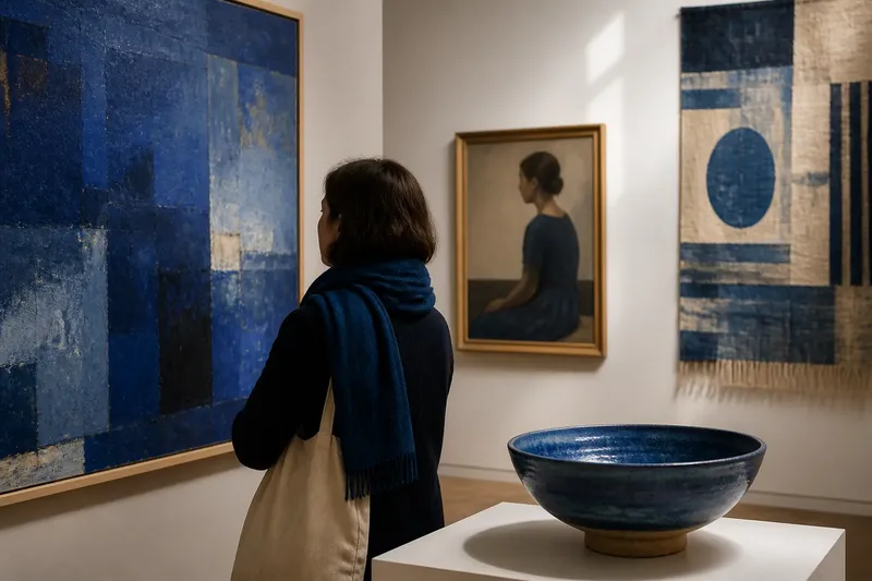
You stop in front of a blue painting, then notice the same blue on a visitor’s scarf and in a ceramic bowl across the room. A gallery visit with one colour in mind begins with that ordinary recognition. Choose a colour, follow it from work to work, and watch how its neighbours, scale and setting alter what it seems to do.
Choose a colour
Pick a colour you can recognise without settling its exact name. Red is useful because it can be loud, muted, warm or nearly brown. Green offers plenty of variation, from a sharp painted line to the dull surface of oxidised metal. A colour that already carries an association for you can make the exercise more interesting, though it may also steer your attention.
Do not turn the choice into a test of colour vocabulary. “Blue” is enough; “a slightly greyed blue, perhaps leaning towards violet” can wait until you are looking. The point is not to identify pigments or match a swatch. It is to notice what the colour does in the work and what the work does to your reading of it.
Start wherever the colour catches your eye. It need not be the largest patch or the subject of the picture. A narrow stripe, a reflection on glass or a small detail in a crowded image can make a better first stop than a wall-sized field that announces itself from the doorway.
Follow the recurrence
Move through the room at an unhurried pace and register each appearance that feels worth a second look. The colour may be painted, printed, woven, glazed or present in the material itself. It may sit at the centre of the work or hide near an edge. The route does not have to be complete; galleries are not colour-indexed, and the labels rarely apologise for this.
At each work, pause long enough to ask a small set of questions:
- Where does the colour sit: at the centre, along an edge or scattered through the surface?
- How much space does it occupy, and does that amount feel important?
- Which colours, materials or forms touch it?
- Does it seem to advance, recede, glow, dull or hold the eye still?
- Does the room’s light or the work’s surface change its appearance as you shift position?
These are prompts, not boxes to fill in. One answer may be enough. If the colour appears in several works close together, compare them before moving on. If it disappears for a while, let it. A gap can make the next appearance feel less like repeated decoration and more like a fresh decision.
Notice its neighbours
A colour rarely works alone. A warm red against a pale ground may appear to press forward; placed beside deep green, it may feel steadier or more ceremonial. Blue next to white can seem crisp, while the same blue against brown may look subdued. These are not fixed rules. The particular hue, surface, light and shapes around it all matter.
Look at the edge where your chosen colour meets another. A clean, sharp boundary can make the colour feel deliberate and contained. A soft blend, broken mark or uneven edge can make it seem to spread or waver. In woven work, the effect may come from individual threads rather than a single flat patch. In a glazed pot, the colour can change with the curve and the light sliding across it.
Then look beyond the work. A pale wall, dark doorway or neighbouring canvas can alter the colour’s apparent force. Stand where the whole work is visible, then move closer if the room allows. The colour’s role may change with distance: a field from across the room can resolve into separate marks at close range. Follow the gallery’s access rules and leave other visitors a clear view; there is no prize for inspecting a brushstroke from an inch away.
Compare different uses
When the same colour turns up in different kinds of work, ask what job it is doing. In a portrait, it might describe clothing, skin or reflected light. In an abstract painting, it may organise the surface without naming an object. In a print, its flatness or repetition may matter more than any suggestion of depth. In a ceramic piece, the colour can belong to the object’s skin, while its shape determines how it is seen.
Imagine you choose yellow and encounter it first as a small stripe in a calm grey painting. Later, you find it in a bright textile pattern and then as a thin glaze on a bowl. The stripe may feel like a point of emphasis, the textile’s yellow may contribute to a lively rhythm, and the glaze may look quieter as it follows the bowl’s curve. The colour stays recognisable, but its surroundings and material give it different work to do.
Try comparing scale as well as medium. A small mark can direct attention precisely; a broad area may set the mood before you have noticed its details. Neither use is more successful by default. Ask what your eye does first, where it goes next, and whether the colour keeps returning to your attention or gradually recedes.
Keep a light record
A few words in a notebook can help you retain the differences without turning the visit into paperwork. Note the colour, the material or kind of work, and one observation about its effect. For instance, “green thread, rough surface, draws the eye to the edge” identifies the material and the visible effect; “green appears in three places, so I stopped noticing it” records a different response. A simple sketch of the colour’s position can help when arrangement matters more than exact shade.
If you prefer not to write, hold one comparison in mind as you walk: the red that looked flat on paper beside the red that seemed to catch the light on metal. You can also return to one work near the end of the visit. Seeing it after several other uses of the colour may change what you notice, even though the object itself has not changed.
Do not spend the visit trying to record every appearance, identify every pigment or decide what the artist intended. Those tasks can crowd out the direct act of looking. A phone photograph may preserve a general impression, but it cannot reliably settle how a colour looked in that room; screens and gallery lighting have different habits.
Questions as you look?
What colour should I choose?
Choose one you can recognise across different works, such as red, blue, yellow or green. If it appears rarely, treat each encounter as useful rather than changing your choice at once.
What if the colour is absent from a room?
Move on without searching every corner for it. A break in the sequence gives you room to notice how the next appearance differs from the last.
Should I read the labels?
Look first, then read a label if you want context about the work or its materials. The exercise concerns what you can observe, not guessing the artist’s intention from colour alone.
Can I do this with a group?
Yes, if each person is free to follow a different appearance and compare observations afterwards. Ask what the colour seemed to do rather than whether someone else’s response was correct.
Let the colour shift
The useful result is not a verdict on whether the colour is cheerful, solemn or beautiful. It is a clearer sense of how those impressions are made: by placement, contrast, surface, scale and the surrounding room. A gallery visit with one colour in mind can sharpen that attention without asking you to see every work in the same way.
As you leave, notice whether the colour still seems to belong to the paintings and objects, or whether it has begun to appear in the building itself: a painted door, a sign or a patch of reflected light. That last sight is not part of the exhibition, strictly speaking. It is still a useful reminder that looking does not stop neatly at the frame.