Why Negative Space Can Hold a Drawing Together
Negative space in drawing helps you see how gaps organise attention and proportion, with a simple looking exercise you can do using any drawing.
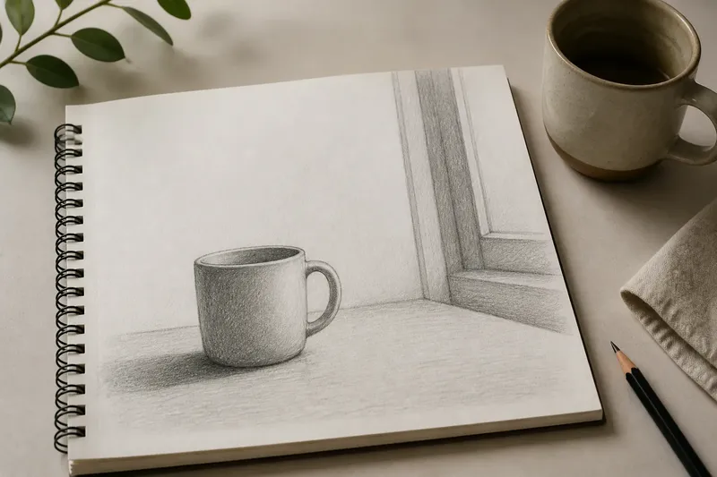
The handle of a mug nearly touches the edge of a sketchbook page, while the mug itself sits comfortably in the middle. Negative space in drawing—the unmarked area around and between forms—can explain why that small gap feels tense. Look at the empty area as carefully as the mug, and the drawing’s arrangement becomes easier to read.
You do not need to draw over anything to try this. Choose a drawing with a few clear shapes, either your own or one in a book, and use your eyes as the only tool. The aim is to notice what the gaps are doing, not to judge whether the drawing is good.
Choose a clear drawing
Start with a drawing whose objects or figures are easy to distinguish from one another. A chair against a wall, a plant in a pot, or a person seated beside a table will do. Avoid a crowded scene at first; small gaps become hard to separate when every edge competes for attention.
Settle on a comfortable viewing distance, then let your gaze move across the whole image rather than fixing on its most recognisable subject. Notice the space between that subject and the edge of the paper, as well as the gaps among its parts. The margin is part of the composition too, though it rarely gets invited into the conversation.
Find the largest gaps
Look for the broadest unmarked areas. They might be the wall beside a chair, the sky above a roofline, or the open shape between a bent arm and a body. Give each gap a plain description: narrow, broad, wedge-shaped, open, or boxed in.
Then compare the gaps. Does one seem to carry more visual weight because it is broad, or because its shape points towards something? A slim opening between two objects can draw attention precisely because it is pinched. The eye reads the gap’s boundaries together, much as it reads the outline of a solid form.
Imagine you are looking at a drawing of a vase beside a window. The open strip between the vase and the window frame looks narrower near the table and wider above it. If you follow that taper with your gaze, you may find that it leads towards the vase’s shoulder; the expected result is a clearer sense of how the objects sit in relation, without needing to name either one.
Trace the intervals
Choose one object and follow its edge with your eyes, slowly. At each turn, notice the shape left between it and the nearest form. Do not trace every contour at once. A single interval is enough to show whether the objects feel close, separate, or almost connected.
Now shift to a second gap and compare its width or direction with the first. In a drawing of two cups, for instance, the gap between their rims may be wider than the gap between their bases. That change gives the pair a particular relationship. If the intervals were more even, the cups might appear more parallel or more deliberately arranged.
This is not a measurement exercise. You are comparing visual relationships: one opening is tighter than another; one blank shape leans towards the page edge; another sits level with a tabletop. Such comparisons help you notice placement without turning looking into a contest with a ruler.
Read the page edges
Next, compare the main forms with the edges of the paper. Look at the empty margin above, below, and to each side of the subject. Is the form crowded against one edge, or does it have room to breathe? Does a projecting branch, elbow, or roofline seem to push into the margin?
The page edge provides a fixed boundary, so the adjacent blank space can make a form feel settled or precarious. A head close to the top edge may seem to press upwards; generous space there can make it feel quieter. Neither arrangement is automatically better. What matters is whether the space supports the kind of attention the drawing invites.
Check the corners as well. A large empty corner can balance a dark or intricate area elsewhere, but it can also feel detached if no line or direction connects it to the rest of the image. Notice the effect before deciding what you think of it.
Notice the visual routes
Let your eyes travel through the unmarked shapes again. Some gaps make a route from one part of the drawing to another. A diagonal opening may guide the gaze towards a face; a band of space under a shelf may carry it across the page. Other gaps stop the eye, holding a boundary between nearby forms.
Ask where your gaze goes next after it enters a blank area. Does it move towards a strong contour, follow a line, or drift out towards the paper edge? This reveals how empty space participates in the drawing’s rhythm. It is not merely the pause between important objects; its outline and position can direct attention in their own right.
Keep the exercise modest. Trying to assign a meaning to every patch of paper is not worth the effort. Some spaces simply let the forms remain legible, and that is useful work without a grand interpretation attached.
Questions about negative space?
What counts as negative space in a drawing?
It is the unmarked area around or between drawn forms, including the area between a subject and the edge of the page. A space can be small or broad, enclosed or open; its role depends on the shapes bordering it.
Why does negative space affect composition?
The gaps make relationships visible: distance, direction, balance, and enclosure. Their shapes can also guide the eye, even though they contain no drawn object.
Can I use this exercise with my own drawing?
Yes. Look at the drawing without adding marks, and compare its largest gaps, intervals, and margins. If you are drawing as well as looking, you can later adjust a contour or placement in response to what you noticed.
Do I need to draw the empty shapes?
No. Naming a gap’s shape or comparing it with another is enough for this exercise. Drawing around the gaps is an optional practice, not a requirement for understanding them.
Carry one observation forward
Before setting the drawing aside, choose one gap that changed how you saw the image. It might be the narrow space between a shoulder and a chair, or the broad margin above a small subject. Keep that observation specific: “the opening widens towards the top” is more useful than “the composition feels balanced”.
When you return to negative space in drawing, look for that same kind of relationship in a different image. The point is not to make every blank area carry a message. It is to recognise that the unmarked parts help determine where forms sit, what touches, and where the eye has room to go.